2011/01/24
2011/01/23
Hannu Oksa: Sun Effects
Identyfikacja powstała dla fińskiej firmy Sun Effects, zajmującej się oświetlaniem wystaw, występów, koncertów. Jak tłumaczy sam autor, Hannu Oksa:
The identity builds from the basic idea of how audiovisual design (and light and sound in general) has the ability to shape and control space and environment: they can create new perspectives or change the nature of a space completely. In other words, light, sound and space are permanent parts of an equation that has limitless outcomes based on how you use them.
Light and sound as elements and audiovisual design as a field of art are constantly changing and evolving. By giving the identity the possibility to experimentation and evolution in itself, it reflects the field of work in a powerful way.
The identity uses a quasi periodic eight fold grid as a basis. The grid is used much like a raster to form a set of building blocks. By using the blocks with a general set of rules the identity allows for the symbol to have endless variations and still retain a conjunctive form.
Baldinger & Vu-Huu
With my partner André Baldinger, under baldinger•vuhuu, we won the pitch for the new visual identity of the higher school of design “École Estienne Paris”. We proposed a dynamic modulable logo, representing the two universes of the school: “Tradition” and “Modernity: What defines the École Estienne are two universes: “École” (School) as the place of the studies, contemporary creation and modernity. “Estienne” as tradition, history and the knowledge to make.

The “É” capital represents the school and the “e” lowercase represents Estienne. The line binds these two universes in an inseparable way. It symbolizes the transfer tradition and know-how in our modern world. The School, in its modernity, remains connected to the History.
The line is elastic. It has a minimal length and can be stretched according to the desires and the needs.
It thus allows the application in all the situations, 2-dimensional like 3-dimensional while thinking of objects
or of the future signage system of the school.
The “É” capital letter refers to the architectual plan of the school, the place of studies. The "e” lower-case is inspired by the manuscript writing.
 The logo comes with the additional mention and name of the school “École Estienne Paris”.


2011/01/18
dekonstrukcja fontu


2011/01/17
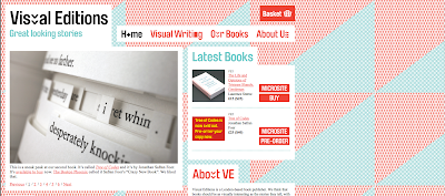
Visual Editions
"We wondered why there is such a large divide between text-driven literary books on the one hand and picture-driven art and design books on the other. And we wondered why this divide seems so extreme, when most of us compute visuals in our everyday more than ever before. We believe this visual everydayness adds to the way we read, it adds to the way we experience what we read and the way we absorb and understand the way stories are told: through words and pictures."


2011/01/16
Traumgedanken
The book “Traumgedanken” (“Thoughts on dreams”) contains a collection of literary, philosophical, psychological and scientifical texts which provide an insight into different dream theories.
To ease the access to the elusive topic, the book is designed as a model of a dream about dreaming. Analogue to a dream, where pieces of reality are assembled to build a story, it brings different text excerpts together. They are connected by threads which tie in with certain key words. The threads visualise the confusion and fragileness of dreams.
On five pages there are illustrations made out of thread. Their shape and colour relies on the key words on the opposite page. This way an abstract image of the dream about dreaming is generated.
In addition there are five pages where a significant excerpt from a text of the opposite page is stitched into the paper. It is not legible because the type’s actual surface is inside the folded page. This expresses the mysteriousness of dreams and the aspect of dream interpretation.


